A print is a fine art work created from a matrix (wood, metal, stone, etc.) that has been engraved or prepared by the artist, inked, and printed on paper using a press. Unlike posters or reproductions, fine art prints are produced in strictly limited editions, with each impression pulled individually. Among the most highly regarded and widely collected printmaking techniques are lithography—which played a central role during the School of Paris—screen printing, now firmly established in contemporary art, and engraving, exemplified by Rembrandt’s metal engravings or Hokusai’s Japanese woodblock prints.
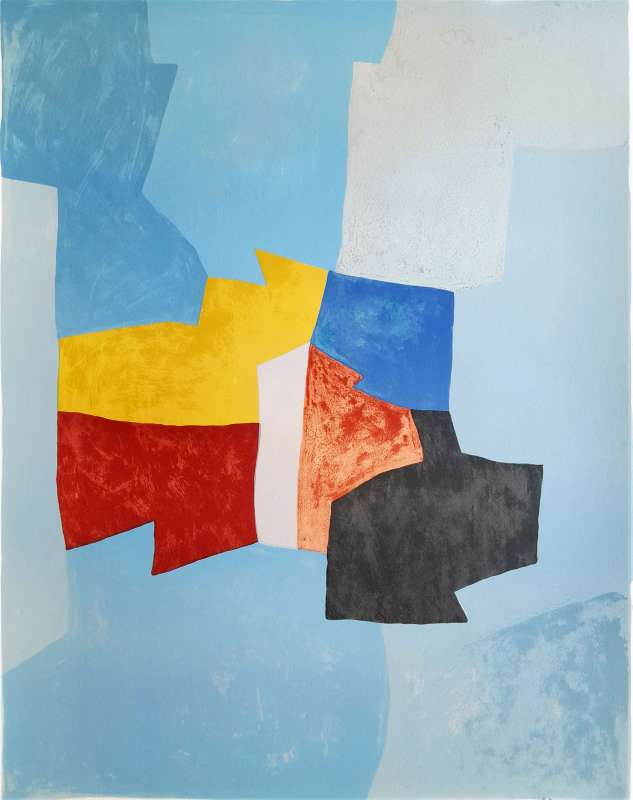
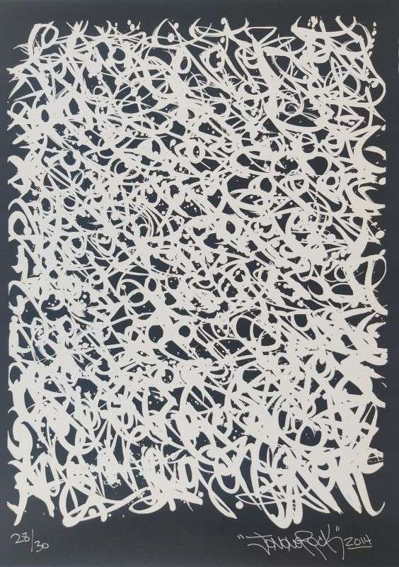
A lithograph by Serge Poliakoff and a screen print by JonOne—two printmaking techniques that are firmly established in the international collectors’ market.
An original print is a work conceived and executed directly on the matrix by the artist, who supervises the printing process and approves the final edition. Original prints are considered autonomous works of art and are actively collected on the secondary market. By contrast, prints created after works by another artist—though often of high quality—are classified as interpretative prints.
The artist’s handwritten signature, along with the edition number (print run justification), typically placed in the lower margin, became standard practice in the late 19th century. These elements are now essential markers of authenticity, rarity, and market recognition.
Due to the manual nature of the printing process—inking, pressure, paper choice—each impression within the same edition presents subtle variations. In addition to the final numbered impressions, artists may pull proofs during the creative process, documenting the evolution of the matrix. These proofs, often produced in very small numbers, are particularly sought after by knowledgeable collectors.
The various techniques used in fine art printmaking can be classified according to the material of the matrix (wood, metal, stone, etc.) or the method of execution (manual or chemical). However, the most widely accepted and historically established classification is based on the type of matrix. The inks used in printmaking also vary depending on the technique employed. In intaglio and lithography, slightly greasy inks are required to adhere to the engraved metal plate or the drawn areas of the stone. In screen printing, dense and opaque inks are predominantly used, allowing for strong color saturation and flat areas of uniform tone.
Wood engraving is a printmaking process that may appear deceptively simple, yet can reach a remarkable level of technical sophistication—particularly in Japanese printmaking. The artist carves a wooden or linoleum block using gouges, knives, or burins, removing material from the surface. The block is then inked, and only the raised, uncarved areas transfer ink onto the paper. For this reason, the process is classified as relief printing. While the principle recalls stamping techniques, the artistic complexity increases dramatically when a high degree of precision and detail is required. Wood is a resistant material, demanding exceptional control and virtuosity. When multiple colors are involved, a separate block must be carved for each color and printed successively, with perfect registration. Even a deviation of a millimeter can affect the final composition. We now turn to the two principal matrices: wood and linoleum.
Although woodcut printing was already practiced in China as early as the 7th century, its development in Europe dates to the late 14th century. The woodblock is carved along the grain, producing a distinctive visual character. By using several blocks—each dedicated to a specific element or color—and printing them successively onto the same sheet, artists can achieve richly layered color compositions. Wood engravings are typically recognizable by their crisp contours, resulting from the hardness of the wood, as well as by subtly irregular flat areas caused by the natural surface of the material.
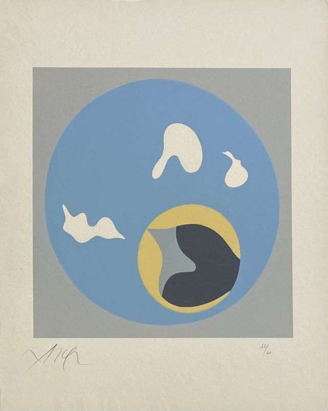
A wood engraving by Hans Arp, Soleil Recerclé, printed on Auvergne paper by the Féquet & Baudier workshop.
The work reveals both soft, organic forms and sharper angles. The apparent simplicity of the flat areas conceals a demanding engraving process requiring great technical precision.
Linocut follows the same technical principles as wood engraving, differing primarily in the material used. Linoleum is softer, easier to carve, and significantly less costly. For this reason, it has long been favored by students and amateur printmakers. However, linocut gained true artistic recognition in the 20th century, notably through Picasso, who elevated the medium to a major form of artistic expression. The artist developed an innovative reduction technique, carving successive layers from a single block to print multiple colors. Each stage permanently alters the matrix, leaving no possibility of correction—a process that underscores both the conceptual and technical commitment of the artist.
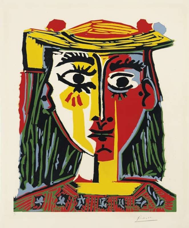
This linocut depicting a woman’s bust by Pablo Picasso illustrates both the expressive range of the medium and the artist’s radical approach to color and form.
Different techniques may be combined within a single print. A polychrome impression can be produced either from a single matrix, selectively inked with different colors, or by printing several matrices in succession, each dedicated to a specific color. This layered approach requires absolute precision in registration and reflects a high level of technical control.
Drypoint is an intaglio engraving technique in which the artist incises a metal plate with a sharp point. Together with burin engraving, it belongs to the family of direct engraving methods, in which the image is cut directly into the plate, as opposed to indirect techniques where acid is used to etch the metal. Both approaches fall under the broader category of intaglio printmaking, commonly referred to as metal engraving.
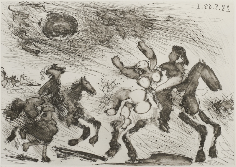
This engraving by Pablo Picasso contrasts the fluidity of etching in the figures with the incisive, expressive line of drypoint in the background.
The use of drypoint dates back to the 15th century. The term refers to the simple steel needle used to engrave the metal plate. Unlike other intaglio techniques, drypoint leaves raised burrs on either side of the incised line. These burrs retain ink both within the groove and on the surface, giving drypoint its distinctive velvety line. This characteristic places drypoint at the intersection of intaglio and relief printing. Because the burrs wear down quickly, drypoint editions are often limited in size, a factor that contributes to their desirability among collectors.
Burin engraving is the oldest form of intaglio printmaking. Its origins lie in the impressions taken by goldsmiths to document their ornamental metalwork. Emerging in the mid-15th century in both Italy and Germany, the technique spread throughout Europe in the 16th century. Using a hardened steel tool known as a burin, the engraver cuts V-shaped grooves of varying depth into a copper plate. After inking and wiping the surface, dampened paper is pressed into the incisions under high pressure. The ink retained in the grooves transfers to the paper, creating a slight tactile relief. The pressure of the intaglio press leaves a characteristic impression around the image, known as the plate mark.
Etching has been practiced since the 15th century and is an indirect intaglio technique, most commonly executed on copper, but also on zinc or aluminum. The metal plate is coated with an acid-resistant ground. The artist draws through this ground with a needle, exposing the metal beneath. The plate is then immersed in an acid bath, where the exposed lines are bitten into the metal. The depth of the etch depends on the acid concentration and the duration of exposure. By repeating the process and selectively protecting certain areas, the artist can achieve a wide range of tonal values. Etching is frequently combined with aquatint to enrich the surface with tonal depth.
Once prepared, the metal plate is inked and printed onto paper. Compared to direct engraving, etching offers greater fluidity of line, as the drawing tool glides easily over the varnished surface. This technique allows for deep blacks, transparency effects, and a broad range of textures, making it particularly attractive to modern and contemporary artists.
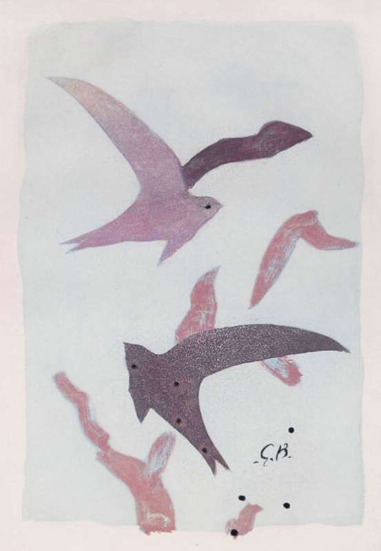
A refined etching by Georges Braque, featuring his iconic bird motif.
Invented in the mid-18th century by the French artist Jean-Baptiste Leprince, aquatint was developed to reproduce the effects of wash drawing. Fine or coarse resin grains are dusted onto a copper plate and then fixed by heat, rendering them resistant to acid. When the plate is etched, the acid bites around the grains, creating a granular surface. By controlling the grain size and the duration of the acid bath, the artist can achieve subtle tonal gradations. Aquatint is identifiable by its finely textured appearance and produces velvety surfaces and richly modulated areas of tone. Artists such as Pierre Soulages and Serge Poliakoff have explored the expressive potential of this technique. Some artists, including Bertrand Dorny, also use aquatint plates to emboss dampened paper, emphasizing the physical presence of the matrix.
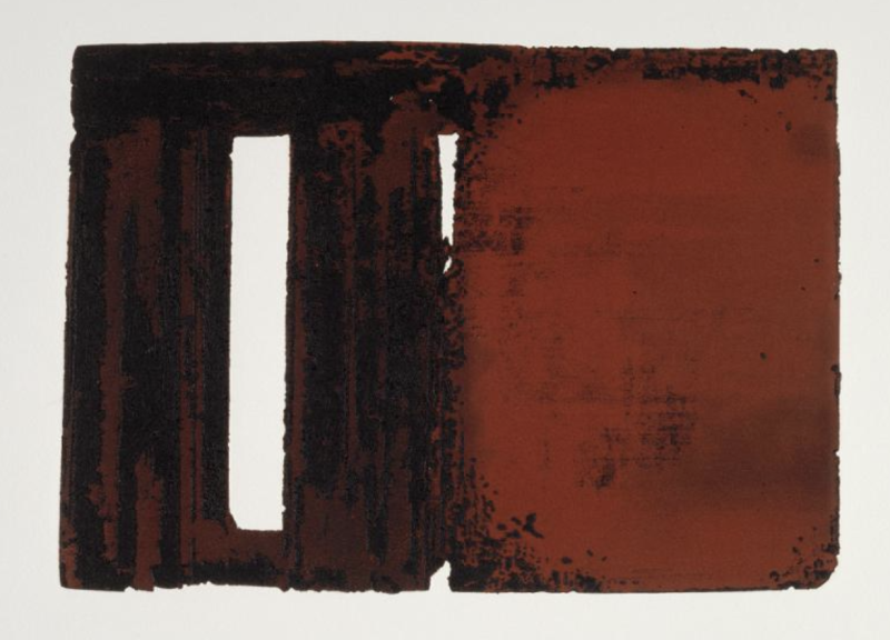
An aquatint by Pierre Soulages, in which extensive acid biting gives the paper a strong sense of texture and relief.
Discovered in 1642 by the German artist Ludwig von Siegen, mezzotint is a hybrid technique combining intaglio and relief principles. The entire copper plate is first roughened with a toothed, semi-circular tool known as a rocker, creating a dense field of burrs that would print as a uniform, velvety black. The image is then created by selectively smoothing or burnishing these burrs. Fully flattened areas produce whites, while partially smoothed zones yield a range of greys. Mezzotint is renowned for its rich tonal transitions but requires extreme precision and care, both in engraving and printing.
Chalcography is a term synonymous with intaglio metal engraving. It also refers to the Chalcography of the Louvre, which preserves an exceptional collection of engraved plates dating back to the 18th century. Today, the institution continues its mission by safeguarding traditional engraving techniques while publishing contemporary prints and reissuing historical works.
Heliogravure refers to a high-quality photomechanical printing process capable of producing a large number of impressions. Originally developed for art books and postcards, grain heliogravure is considered a precursor to photographic printing. Invented by Nicéphore Niépce, its name derives from Helios, the Greek sun god, referencing the long exposure times required. Despite technical evolutions, the process remains based on engraving a copper cylinder that is inked and pressed onto paper. Heliogravure is distinguished by the depth and subtlety of its blacks, the richness of its tonal range, and its ability to yield consistent impressions. It played a key role in the reproduction of early daguerreotypes, the foundations of modern photography.
Lithography is one of the most widely collected and historically significant printmaking techniques. It was extensively used by artists of the School of Paris, notably Miró, Chagall, and Picasso, often in close collaboration with the legendary Fernand Mourlot lithography workshop. The artist draws directly onto a limestone surface—or, in some cases, a zinc plate—which is then inked and printed onto paper. Lithography allows artists to work with familiar tools such as brushes, pencils, and washes, preserving the spontaneity of drawing. The stone may also be scratched or reworked to introduce additional effects. Each color requires a separate stone, and the image is printed in reverse, a process that demands both experience and the expertise of a master printer. While many lithographs are executed directly by the artist, others—such as exhibition posters reproducing painted works—are interpreted by the printer, whose role as a highly skilled chromist is essential to translating the original image onto stone.
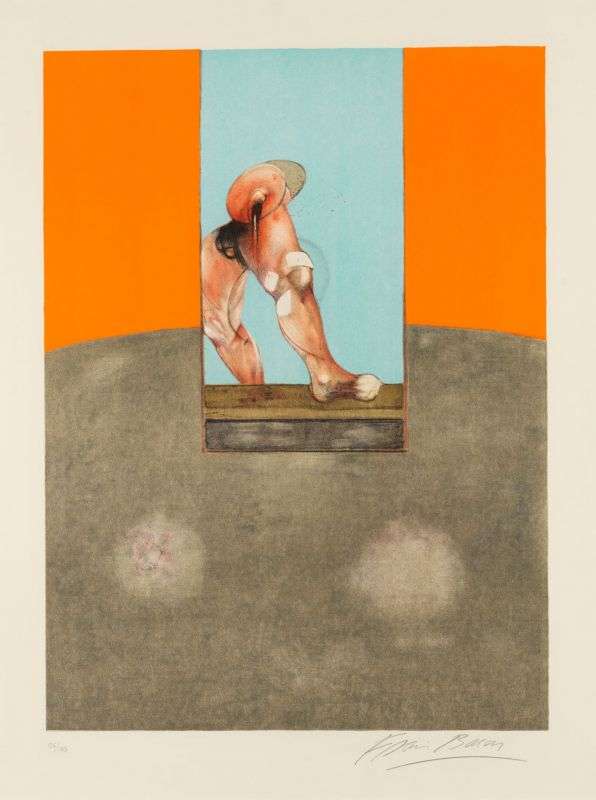
This major lithograph by Francis Bacon reproduces a panel from a triptych held in a private collection. Drawing directly on stone enables a wide range of effects, from flat, saturated areas to highly detailed passages.
Lithography (from the Greek lithos, meaning "stone") was invented in Bavaria around 1798 by Aloys Senefelder and became widely established during the 19th century. This planographic printing technique is based on the natural antagonism between water and grease. On a finely grained, porous limestone, the artist draws with greasy materials. The remaining surface is chemically treated to retain water. During printing, greasy ink adheres only to the drawn areas, while the dampened stone repels ink where the image is not intended to appear. To preserve this balance, the stone must remain constantly moistened. A sheet of paper is then pressed against the stone under the lithographic press, transferring the image through friction. Lithography offers artists exceptional freedom of gesture and line, particularly for works executed "in the manner of drawing." Because water and ink tend to emulsify, artists seeking dense, uniform color fields often prefer screen printing, whose opaque inks allow for more saturated flat areas. Lithography also served as the technical foundation for offset printing, which operates on the same chemical principles.
Zincography is closely related to lithography but substitutes the stone with a zinc plate. The artist draws directly onto the metal surface using painterly tools. Once prepared, the plate is printed in reverse onto paper. Zincography offers greater flexibility and ease of handling than heavy limestone, making it particularly suitable for larger formats. Invented in 1813 by Aloys Senefelder, zincography was widely used until its gradual decline in the 1920s. Among artists of the second School of Paris, Hans Hartung is especially recognized for his expressive use of this technique.
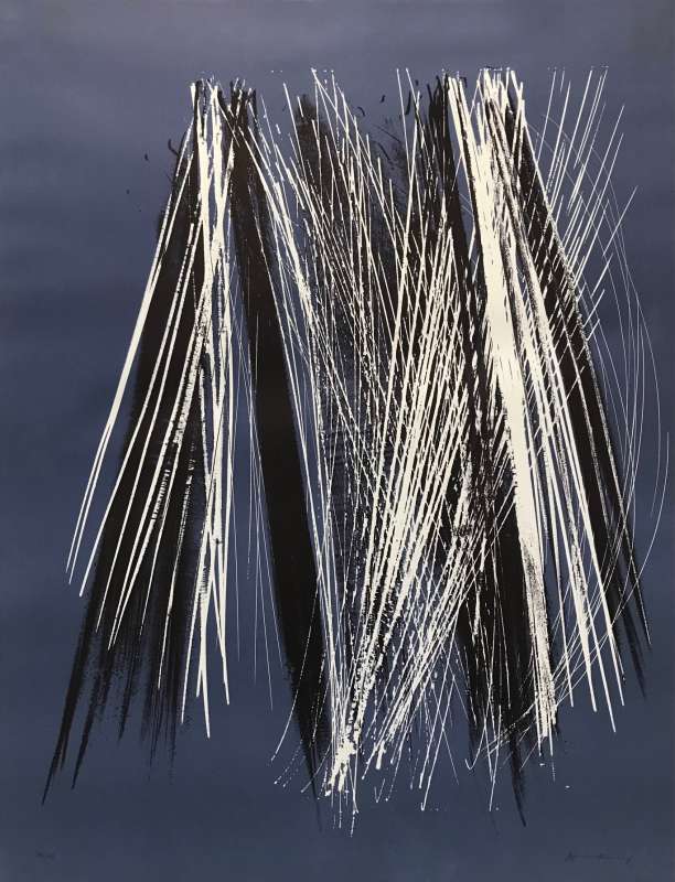
Zincography by Hans Hartung, L 1971-6, on Rives vellum, printed by the Arte – Adrien Maeght workshop.
Autography is a variant of lithography developed to simplify the artist’s working process. The image is first drawn on specially prepared transfer paper and then transferred onto the lithographic stone. This method offers two significant advantages: the artist works on paper rather than directly on the stone, and the drawing can be executed in its natural orientation. The image is then reversed during transfer and once again during printing, resulting in a correctly oriented final impression. Autography thus eliminates the need for the artist to draw in mirror image, as required in traditional lithography.
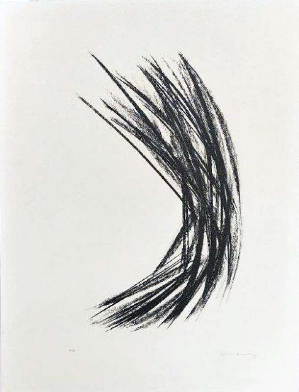
Autography by Hans Hartung, L 30, on BFK Rives vellum, printed by the Jean Pons workshop.
Offset printing is a modern, photomechanical evolution of lithography, widely used for large-scale production such as magazines, catalogs, and advertising, and occasionally adopted by artists. In this process, a digital image is transferred onto an aluminum or polymer plate mounted on a printing cylinder.
Although offset printing is efficient for producing large editions, it generally offers lower visual and material quality than traditional lithography. Under magnification, the mechanical dot pattern becomes visible. Offset is therefore primarily used for high-volume limited editions or by contemporary artists who deliberately embrace industrial printing methods. Since the 1980s, the term digital print has also been used to describe works whose matrix is created through computer-based processes.
Screen printing is a printmaking technique widely used to produce limited editions, particularly appreciated for its saturated colors and dense, uniform flat areas. Beyond its contemporary applications, the technique was already embraced by artists of the School of Paris. Notably, Sonia Delaunay produced numerous screen prints in collaboration with the publisher Galerie Denise René. Screen printing allowed her to faithfully translate her interlocking color planes and her celebrated Color Rhythms into print form, preserving both intensity and structural clarity.
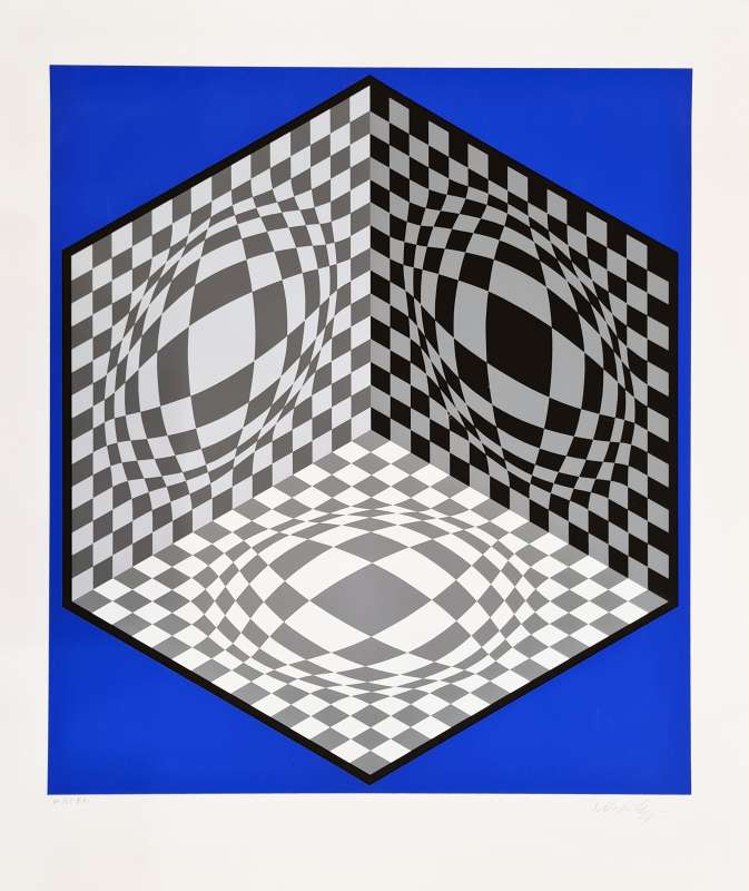
A signed screen print by Victor Vasarely, Phobos.
Screen printing is a printing process based on the use of a silk screen and derives from the stencil method. The artist prepares the screen—stretched over a frame—by drawing the image with liquid latex, which temporarily blocks the mesh. Once dry, a sealing varnish is applied to prevent ink from passing through the areas intended to remain unprinted. The latex is then removed, reopening the mesh in the image areas. Ink is placed along the edge of the screen and drawn across the surface using a rubber squeegee, allowing it to pass through the open mesh and deposit onto the paper. This operation is repeated for each color. The opaque, covering inks used in screen printing allow colors to be layered with precision and consistency, a quality that has made the technique particularly attractive to modern and contemporary artists.
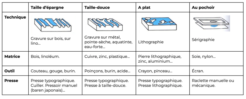
Below is a summary table of the main printmaking techniques:
Carborundum engraving is a printmaking technique based on the creation of a textured matrix, often made from plexiglass, cardboard, or similar supports. Materials such as adhesive mixed with varying grades of abrasive grit—commonly referred to as carborundum—as well as putty or other substances, are applied to the surface to build relief. Once dry, the matrix is inked and passed through the press, producing prints characterized by strong material presence, rich blacks, and pronounced embossing effects.
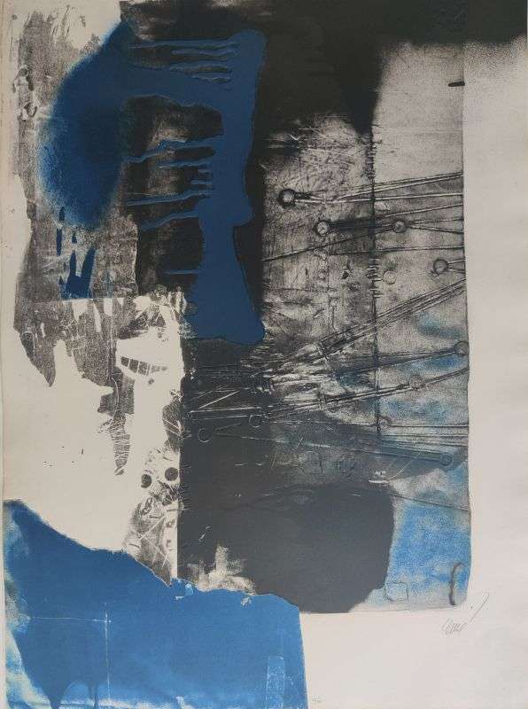
Aquatint and carborundum by Antoni Clavé, printed by the Poligrafa workshop.
By incorporating sand into the matrix, the artist achieves a distinctive grain and a pronounced relief, giving carborundum prints their powerful tactile quality.
Aquagravure is defined by the simultaneous creation of the matrix and the paper impression. The artist carves and models the image in low relief on a wax plate or other materials such as wood, metal, or linoleum. When printed, the damp cotton paper is molded directly by the matrix, producing a deeply embossed print. The resulting works are characterized by strong relief and sculptural presence, where paper and image become inseparable.
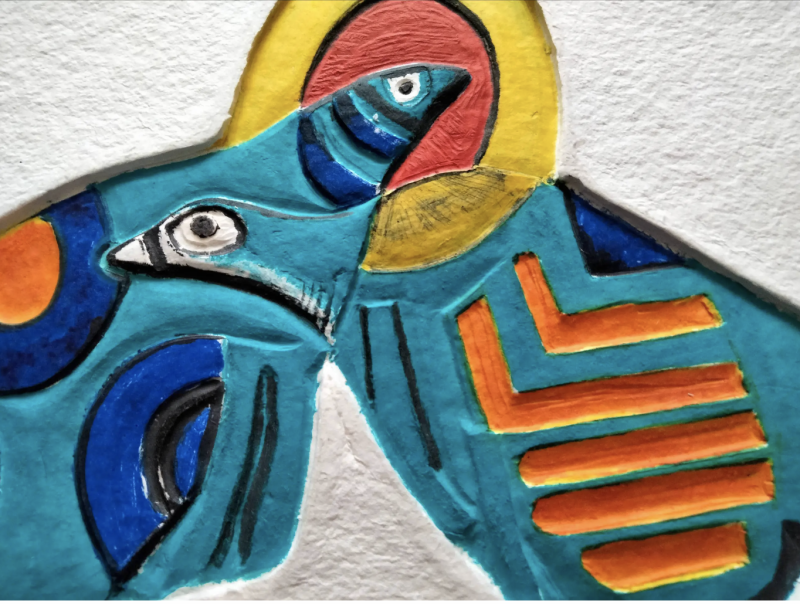
Aquagravure by Cobra artist Guillaume Corneille. The relief of the paper follows the geometric structure of the composition.
Stencil is the historical precursor to screen printing. The technique consists of cutting shapes into thin metal sheets or cardboard, through which gouache is applied by hand using a brush. Although stencil is not a printmaking technique in the strict sense—since no press is involved—it allows for the production of serial works, executed either by the artist or by a craftsman under the artist’s supervision. Because the gouache is applied directly to the sheet, stencil works retain a painterly texture, vibrant flat areas, and luminous colors. Screen printing later introduced a mechanical or semi-mechanical process to this principle, distinguishing itself from the fully manual nature of stencil.
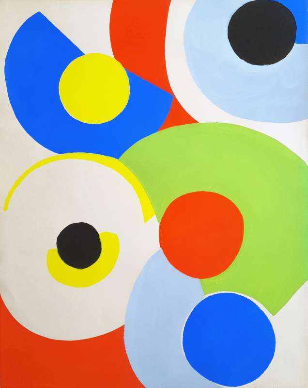
Stencil by Sonia Delaunay, Poetry of Words, Poetry of Colors.
Monotype is a painterly printmaking process in which the artist paints directly onto a plate using printing inks. The image is transferred to paper either by press or by hand, producing a single impression. By definition, a monotype is a unique work, sometimes annotated 1/1. The resulting image is often translucent, with subtle tonal variations and a finish reminiscent of watercolor.
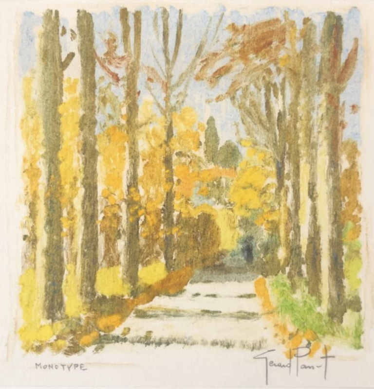
A monotype by Gérard Panet, revealing the medium’s unique texture and pictorial depth.
Soft-ground etching is an intaglio technique in which a copper plate is coated with a soft, tacky ground. A textured paper is laid over the plate, and the artist draws on the paper with a pencil. The pressure lifts the ground where the line is drawn. The plate is then etched, allowing the exposed areas to be bitten by acid. This method produces lines with a soft, tactile quality, often resembling drawing or fabric textures.
Sugar-lift etching is an indirect intaglio process based on lifting the varnish. A mixture of sugar and India ink or gouache is painted directly onto the metal plate. Once dry, the plate is covered with a varnish and immersed in water. The sugar dissolves, lifting the varnish in the painted areas. The exposed metal is then etched in acid, translating painterly gestures into intaglio form.
Among modern papers—most of which are mechanically produced—there exists a wide range of qualities, weights, and textures. Each type of paper responds differently to the demands of specific printmaking techniques. Lithographs, for example, are frequently printed on Vélin d’Arches, BFK Rives, or Pearl Japan, prized for their stability and surface regularity. By contrast, woodcuts and intaglio prints are often enhanced by more tactile supports such as Richard de Bas (a traditional handmade paper) or Lana Vellum, which accentuate relief and depth. Some papers bear a watermark—the manufacturer’s mark visible in transparency—which assists in identifying the paper and, in certain cases, in dating an impression. It is not uncommon for a single edition to exist on different papers (for example, Vélin d’Arches and Pearl Japan), a detail of particular interest to informed collectors.
Anyone who has visited a paper mill will be familiar with the fundamental stages of papermaking, whether executed by hand or by machine. In essence, cotton fibers are transformed into a paper pulp, then formed into sheets using a mold and carefully dried. The result is a sheet whose texture, weight, and absorbency will directly influence the final character of the printed work.
Let's examine the main types of paper used in printmaking. The most common is vellum paper, known for its strength and ability to print the matrix well. This paper is characterized by a fine and velvety texture, which enhances the printed image. It comes in different thicknesses or "weights". Among these, there are very thin papers, known as “parchment paper”, frequently used in restoration work.
Among the most renowned manufacturers for printmaking are Arches, BFK Rives, Johannot, and Moulin du Gué. It's important to note that all these names have been associated with the Arches company since the 1950s, thus consolidating their reputation in the field of quality paper manufacturing for art printing.
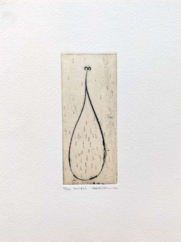
Velvety vellum paper bearing an engraving by Seiko Tachibana
Moulin d'Arches was founded in the late 15th century, the era when Christopher Columbus discovered America. From its inception, the Arches company has been committed to producing high-quality paper sheets. While other manufacturers began integrating rosin into their paper for economic reasons as early as the 1820s, Arches maintained traditional methods, thus ensuring a durability of over a hundred years for its papers. According to Arches, in the 19th century, up to 90% of limited editions of artworks were printed on Arches paper.
Composed entirely of cotton, this paper presents a unique texture and can withstand multiple passes through the press, essential for color prints that sometimes require more than ten impressions. The round molding technique gives the paper fringed edges, that is, non-smooth edges. Additionally, Arches paper contains an alkaline reserve, protecting it against the acidity present in the wood of storage furniture or frames. However, it is advisable to store the sheets under appropriate conditions, away from direct contact with acidic materials like wood or cardboard.
In the 20th century, many artists from the School of Paris, such as Miro, Picasso, or Chagall, favored Arches paper for their prints, due to its quality and longevity. The name and watermark of Arches are marks of distinction that you will frequently find on the prints of these artists, ensuring the work's longevity over time.
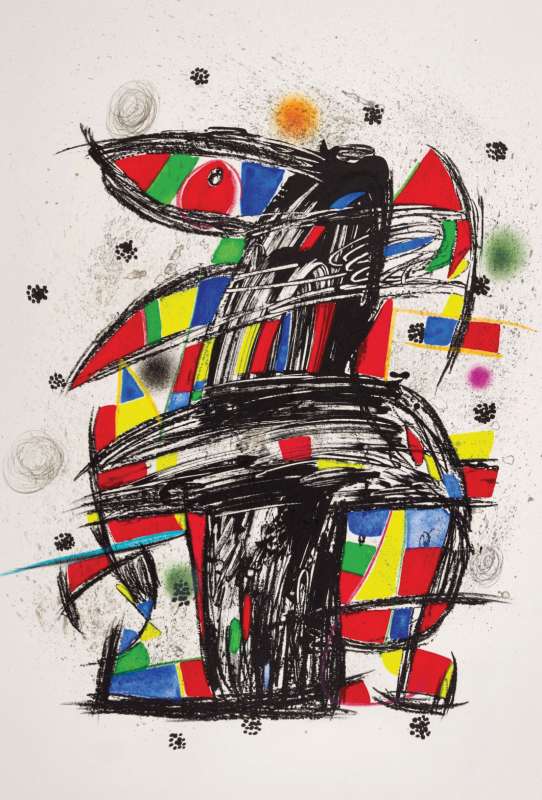
An exceptional large-format lithograph by Joan Miro. The thick and velvety Arches paper accentuates the colors and textures of this artwork.
BFK Rives, named after the initials of its founders, is a paper mill located in Rives, Isère. It was active from 1920 until the mid-20th century, before being eventually acquired by its competitor, the Arches company. BFK Rives specialized in the production of papers similar to Arches Vellum, with a particular emphasis on a smooth grain designed to be discreet and enhance the printed work. This paper, known for its exceptional qualities in intaglio engraving, is ideal for works rich in detail.
Like Arches, BFK Rives saw significant growth through public orders, notably for the production of banknotes and administrative documents. The last BFK Rives mill in Rives closed its doors in 2011. However, BFK Rives paper continues to be manufactured by the Arches company.
Like Arches paper, BFK Rives features an alkaline reserve and fringed edges. These characteristics make it a favored choice for prints and art impressions.
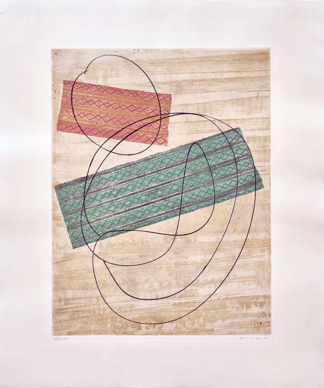
An etching by Max Ernst. The BFK Rives paper, with its very fine grain, is ideal for bringing out the textures of the etching and the precision of the line drawing.
Laid paper is also available, recognizable by the visible lines, left by the manufacturing mold.

Comparison between velvety vellum paper and laid paper with visible lines
There are also special papers such as heavyweight board, colored papers, kraft, and Japanese paper, which can add a unique touch to a work. In Japan, the artisanal paper-making tradition, centuries-old, is becoming scarce. Artisans still active in this field are sometimes recognized as 'living national treasures'. The specialty of Japanese paper, known as Washi, lies in its composition of Japanese mulberry fibers (Kôzô). These long fibers, interwoven in all directions, give the paper remarkable strength. Japanese paper can also be extremely thin, offering a wide range of textures while maintaining exceptional strength. This type of paper played a crucial role in the spread of famous 'Japanese prints', such as the woodblock prints of Hokusai and Hiroshige, which inspired the Japonism movement. This discovery also captivated artists from the School of Paris, like Braque or Picasso, who were drawn to the quality, durability, and sensual texture of 'Japanese paper'.
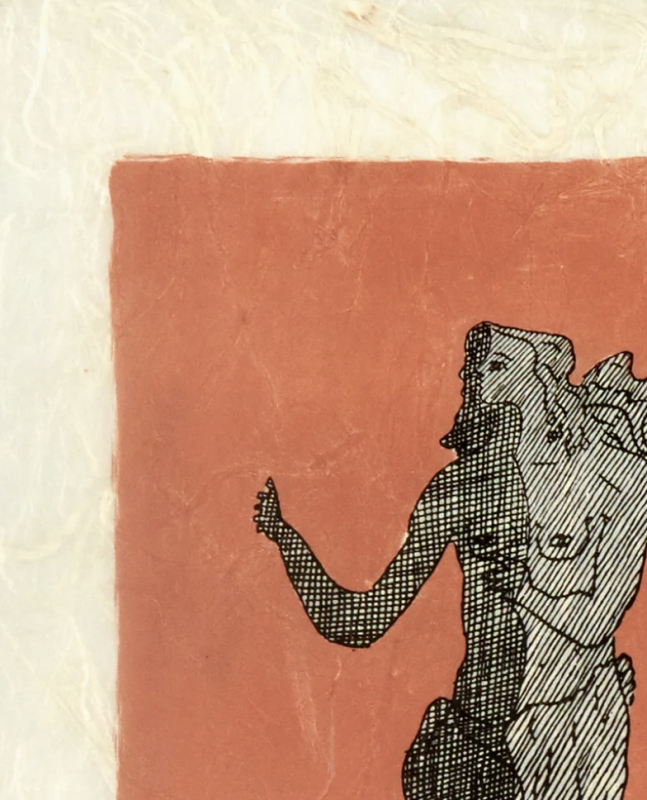
A print by Georges Braque on nacreous Japanese paper, also known as Washi. The paper's veins, due to the fibers of the Japanese mulberry tree (Kôzô), are observable
The history of paper originates in China, where it is traditionally dated to around the 2nd century BC. Early sheets were produced from hemp fibers, mulberry bark, and other vegetal materials. This invention marked a decisive turning point in the transmission of knowledge, allowing information to be recorded, preserved, and circulated with unprecedented ease. Through trade routes and cultural exchanges—most notably along the Silk Road—papermaking techniques gradually spread throughout Asia.
Following their expansion into Central Asia, the Arab world assimilated and refined papermaking methods. Significant technical advances were introduced, including the use of wire-frame molds, which enabled more regular and efficient production. These innovations proved instrumental in the diffusion of paper-making knowledge toward the Mediterranean world and, ultimately, Europe.
In Europe, the first documented paper mill was established in Córdoba during the Middle Ages, at a time when paper remained a precious and costly material. Under strong Arabic influence, Córdoba became a key center for early European papermaking, laying the foundations for a craft that would soon transform intellectual and artistic production.
In the centuries that followed, German and French regions developed their own paper mills in order to reduce reliance on imports from the Iberian Peninsula. Among them, the Arches mill in France—founded in 1492—distinguished itself through the exceptional quality of its papers, which would later become a reference for artists, printers, and institutions alike.
The invention of movable-type printing by Johannes Gutenberg in the mid-15th century radically increased the demand for paper. This growing need accelerated technical innovation during the 18th and 19th centuries, notably with the development of the continuous paper-making machine by the French inventor Louis Robert, subsequently perfected by Henry and Sealy Fourdrinier in England. These advances transformed papermaking, enabling large-scale, consistent, and economically viable production.
Ironically, these industrial innovations eventually returned to Asia, where papermaking had first emerged, completing a remarkable historical cycle. From its origins as a handcrafted support in ancient China to its central role in modern artistic and cultural production, paper embodies a continuous dialogue between tradition, technology, and artistic expression.
The A4 sheet is familiar to most, but in the field of fine art printmaking, paper exists in a wide range of formats that extend far beyond everyday standards. In addition to the internationally recognized ISO A-series formats (such as A3), traditional French paper sizes—such as Raisin or Jésus—have long been used by printers and artists. Japanese printmaking also relies on its own specific formats, distinct from Western conventions. Finally, many artists choose custom dimensions that do not correspond to any standardized format. Below is a reference table showing the correspondence between ISO formats and traditional French paper sizes.
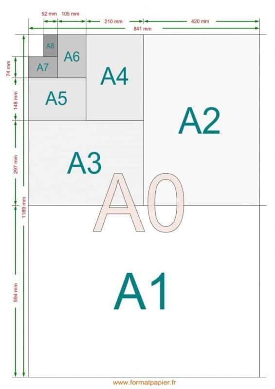
Demi-Raisin — 32.5 × 50 cm
Raisin — 50 × 65 cm
Jésus — 56 × 76 cm
Colombier — 60 × 80 cm
Petit Aigle — 70 × 94 cm
Grand Aigle — 75 × 105 cm
Grand Monde — 90 × 126 cm
Univers — 100 × 130 cm
Grammage does not refer to the thickness of a sheet, but to its surface weight—that is, the ratio between the paper’s weight and its area. It is expressed in grams per square meter (g/m²). While grammage and thickness are not strictly equivalent, a higher grammage generally corresponds to a heavier, more substantial paper. In fine art printmaking, grammage plays a decisive role in the paper’s handling, durability, and interaction with ink.
By way of comparison:
Cigarette paper: approximately 15 g/m²
Newspaper: approximately 40 g/m²
Standard printer paper: 80 g/m²
Vélin d’Arches: typically between 120 and 400 g/m²
Softcover book cover: around 250 g/m²
Watercolor paper: up to 500 g/m²
A watermark is a distinctive mark embedded within the paper itself. It may indicate the manufacturer’s name, a specific paper range, or a symbolic motif. Visible when the sheet is held up to the light, the watermark is created by fixing a brass wire design onto the mold or screen used during papermaking. In these areas, the paper pulp settles more thinly, allowing the design to appear in transparency. Beyond its aesthetic aspect, the watermark plays a key role in identifying the paper’s origin, quality, and, in some cases, its period of production—an important criterion for collectors.
Let us now consider some exceptional paper mills, historically associated with the production of fine vellum papers used in printmaking.
The Arches Mill
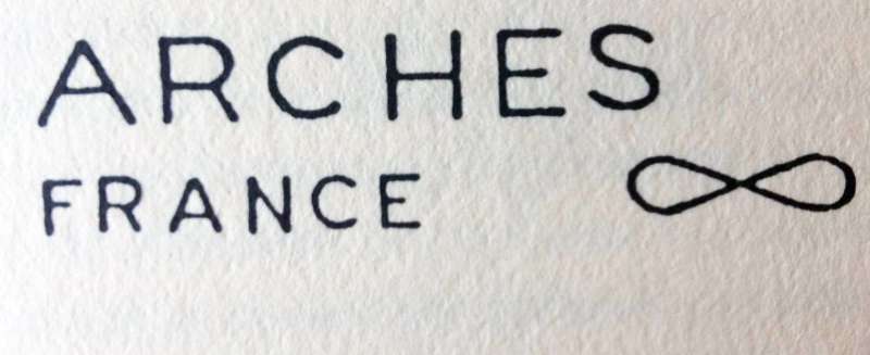 Founded in 1492, the Arches Mill is internationally renowned for the exceptional quality of its vellum papers. From the Renaissance onward, it supplied paper for landmark publications such as the Nuremberg Chronicle illustrated by Albrecht Dürer. Under the direction of Beaumarchais, the mill also printed the complete works of Voltaire. In the 20th century, Arches became the preferred paper for lithographs by artists such as Miró and Picasso, notably at the Mourlot studio.
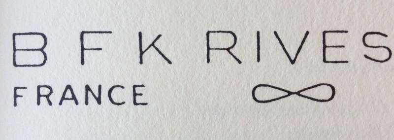 Today, Arches continues to uphold this heritage, producing papers that are widely used by artists, printers, and institutions for fine art printmaking.
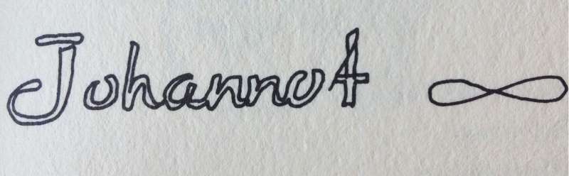
The Moulin du Gué, Johannot, and BFK Rives mills are no longer active as independent producers; their names now designate paper ranges integrated into the Arches Mill collection.
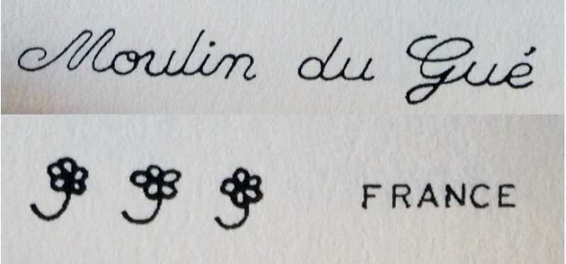
The Moulin du Gué paper range is specifically designed for intaglio printing. The three small flowers visible in the watermark symbolize the 15% linen content used in the paper’s composition.
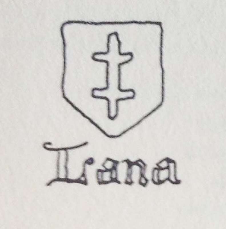
For more than four centuries, the Lana Mill—located near Arches—has maintained its reputation as a producer of high-quality paper. While best known for fine packaging papers, Lana also manufactures cast papers highly regarded in printmaking. The mill offers the possibility of custom watermarks, a feature appreciated by artists and publishers seeking distinctive editions.
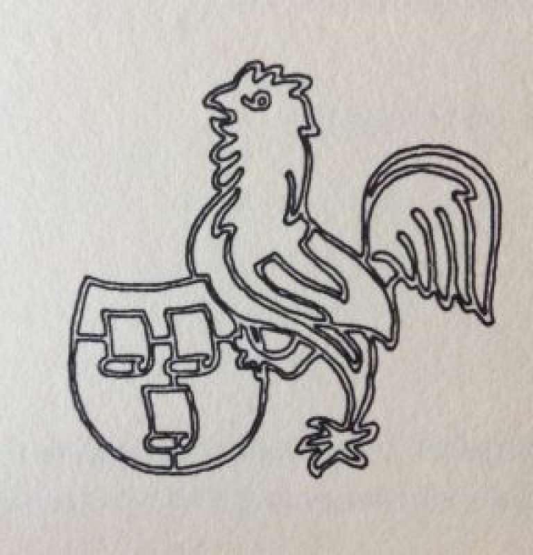
Among international paper producers, the Hahnemühle Mill is especially esteemed by artists working on paper. Founded in 1584, it initially supplied paper to the administration of the Duchy of Brunswick in Germany. Its founder, Carl Hahne, gave his name to the mill and its emblem, the rooster (Hahn in German).
The Whatman Mill in the United Kingdom also deserves mention. It pioneered the invention of vellum paper, the first smooth paper to eliminate the horizontal laid lines traditionally left by the papermaking mold.
The renowned Richard de Bas Mill, producer of traditional Auvergne handmade paper, represents another cornerstone of European papermaking history. In the 15th century, the Auvergne region counted nearly fifty mills, its central location facilitating the circulation of paper throughout Europe.
This particularly fine paper was used for printing the engravings of Diderot and d’Alembert’s Encyclopedia, underscoring its exceptional quality and durability.
Shown here is the wire used to create the watermark within the paper sheet.
There is often confusion surrounding the notion of an “original print.” Is a print merely a reproduction of an existing work, or is it an original work of art in its own right? The answer involves important distinctions. In short, an original print refers to a work that has been conceived, executed, or at least closely supervised by the artist, and approved by them through signature.
In order to clarify professional and commercial practices, the Chambre Syndicale de l’Estampe, du Dessin et du Tableau (CSEDT), which represents print dealers and protects collectors, established a Charter of the Original Print. An excerpt follows:
“An original print is a form of artistic expression deliberately chosen by the artist and produced in multiple impressions according to the artist’s intent. Prints not executed by the artist whose signature they bear, or not produced under their constant supervision, must be clearly identified as ‘interpretation prints.’ Contemporary original prints are generally signed and numbered, unlike early prints.”
Charter of the Original Print, CSEDT, 1996.
To better understand the distinctions between originality and authenticity, it is useful to consider three main categories: the original print, the interpretation print, and the photomechanical reproduction.
Unlike an interpretation print—executed by a third party such as an engraver or lithographer—the original print is conceived and created directly by the artist on the matrix itself (stone, copper, steel, zinc, wood, or silk screen). Original prints encompass all graphic techniques, including lithography, intaglio engraving, and screen printing. In this context, the artist creates the matrix and entrusts the printing to a professional printer. This is the case, for example, with Joan Miró’s lithographs, drawn by the artist on stone and printed by the master printers of the renowned Mourlot workshop. Once the edition is completed, the artist validates the print run by signing each impression.
In an interpretation print, an artist’s original work (painting, drawing, or gouache) is translated onto the matrix by a professional lithographer or engraver. This process is most often carried out under the artist’s supervision and may still bear the artist’s signature. The fact that the artist did not personally engrave or draw on the matrix does not automatically diminish the artistic or market value of the print. A well-known example is the refined interpretation lithographs of Marc Chagall executed by Charles Sorlier at the Mourlot workshop.
A photomechanical reproduction is the mechanical reproduction of a unique work or an existing print using modern industrial processes rather than traditional printmaking techniques. Such works are generally not considered original prints. Often referred to as “reproductions,” “posters,” or “offset prints,” these facsimiles may be authorized or unauthorized. While some editions retain decorative or historical interest, many reproductions—and even outright forgeries—circulate on the market. These may include items produced for museum shops or works intended to mislead buyers. Caution is therefore essential when acquiring prints of uncertain origin.
This typology highlights varying degrees of artistic involvement in the printmaking process. At a minimum, an original print must be supervised by the artist and approved through their signature.
To summarize, here are the words of the renowned lithographic printer Fernand Mourlot:
“An original lithograph is a lithograph executed by the artist himself—that is, he draws directly on the stone or zinc using lithographic pencil, brush, or wash.”
“If the artist attended the creation of the lithograph, even if he did not execute every step himself, if he approved it, corrected it, validated the final proof, supervised the printing, and signed the impressions, it is considered an original lithograph.”
Fernand Mourlot, Gravés dans ma mémoire, Robert Laffont, 1979.
How can one guard against reproductions or forgeries?
The following guidelines can help ensure the acquisition of an original print, whether signed or unsigned. Navigating the abundance of works offered online or on secondary-market platforms can be challenging, but these principles help reduce risk.
Whenever possible, purchase prints from a reputable gallery. A physical gallery allows direct examination of the work. Established print galleries are often members of the CSEDT.
Verify that the print appears in the artist’s catalogue raisonné, with matching dimensions and edition details. A catalogue raisonné, compiled by specialists, is an essential reference for assessing rarity and authenticity.
Catalogues raisonnés are not always easily accessible, but reputable galleries can often provide excerpts or documentation. Many catalogues are also available online, such as those for Hans Hartung, Anna-Eva Bergman, or Sam Francis.
Online marketplaces and second-hand platforms may offer genuine original prints, but they also present reproductions and counterfeit works. Acquiring prints through these channels involves risk. As a general rule, if a work is priced significantly below market value, it is likely “too good to be true.”
In the context of printmaking, the term “print” is synonymous with “impression” or “copy.” The complete set of impressions pulled from the same matrix constitutes an edition. The origin of this term derives from the act of pulling the press toward oneself to produce each impression. A limited edition indicates that the number of impressions is strictly controlled by the artist or publisher, with each print individually numbered. Once the predetermined print run has been completed, the matrix is often destroyed in order to guarantee the limited nature of the edition.
The edition justification refers to the detailed breakdown of the entire print run: the number of numbered impressions, artist’s proofs, proofs outside of commerce, impressions printed on different papers, and any other variants. This information may appear on certificates of authenticity, in the catalogue raisonné, or—particularly for artist’s books—in the colophon.
In addition to the numbered edition, it is customary to print artist’s proofs, intended for the artist and the publisher as reference or archival material. Their number generally does not exceed 10% of the total edition. Artist’s proofs are commonly designated as “A.P.” (artist’s proof) or “E.A.” (épreuve d’artiste) and may be numbered using Roman numerals. The designation “H.C.” (hors commerce) is also used. Some prints exist in several states, meaning successive versions of the image, either printed for compositional evaluation or issued as distinct editions. A celebrated example is Picasso’s bull lithograph printed at the Mourlot workshop, known in eleven successive states.
Let us now look more closely at the lower margin of a print. Traditionally, the numbering of the impression within the total edition—such as 23/25 (excluding non-commercial proofs)—appears in the lower left corner. On the opposite side is the artist’s handwritten signature, usually in pencil. Some artists also inscribe the title of the work or the date at the center.
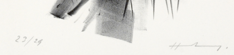
A frequent question concerns the value of numbering itself. Does impression 23 have a different value from impression 1 or 25? In most cases, the answer is no. Numbering is usually carried out by the printer and does not necessarily follow the chronological order of printing. The misconception that earlier numbers are more valuable originates from traditional woodcut or metal engraving, where fragile matrices could wear down during the printing process. In such cases, early impressions may indeed show greater sharpness than later ones.
Another common question is what constitutes a “large” or “small” edition. As a general guideline, an edition of fewer than 150 impressions may be considered limited. Beyond that, the work becomes less rare, as in certain poster editions reaching 2,000 copies. Conversely, some editions are particularly restricted, such as the example by Hans Hartung illustrated above, or many of Picasso’s print editions, which were often limited to 50 impressions.
In modern printmaking, the artist typically applies their handwritten signature in pencil to each impression at the end of the printing process. This decisive step allows the artist to validate the edition and to reject any impressions that do not meet their standards. While not all artists were comfortable with signing—:contentReference[oaicite:0]{index=0} is a well-known example who was reluctant to sign certain interpretation prints—signature remains a fundamental element in guaranteeing both the limited nature of an edition and the quality of each impression.
Within the printmaking world, a frequently cited anecdote illustrates the importance of this control: in the past, unscrupulous publishers allegedly had artists sign blank sheets—most famously :contentReference[oaicite:1]{index=1}—which were later used to produce and sell prints of inferior quality. Such practices are now strongly regulated. Serious publishers and professional dealers adhere to charters governing original prints, which explicitly prohibit these fraudulent methods.
Some prints also bear a printed signature, meaning a signature integrated directly into the composition—drawn on the lithographic stone or engraved into the copper plate. In such cases, the signature is said to be “in the plate,” or replaced by an artist’s stamp. This does not necessarily exclude the presence of an additional handwritten signature.
There also exist unsigned original prints produced from the same matrix as the signed edition. This is particularly common for lithographic illustrations published in art magazines or illustrated books, which flourished during the period of the first School of Paris. Notable examples include the journals XXème siècle, Les Cahiers d’Art founded by Christian Zervos, and Derrière le Miroir published by Maeght.
These unsigned impressions are just as original and technically accomplished as signed prints. They often represent an excellent opportunity to acquire significant works at a more accessible price point. It should be understood, however, that an artist’s handwritten signature considerably enhances a print’s value—both in terms of market price and long-term investment potential.
Let us now examine several examples of artists’ signatures and stamps:
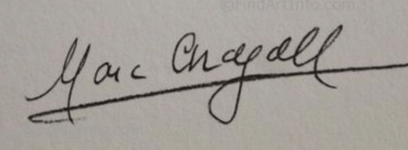
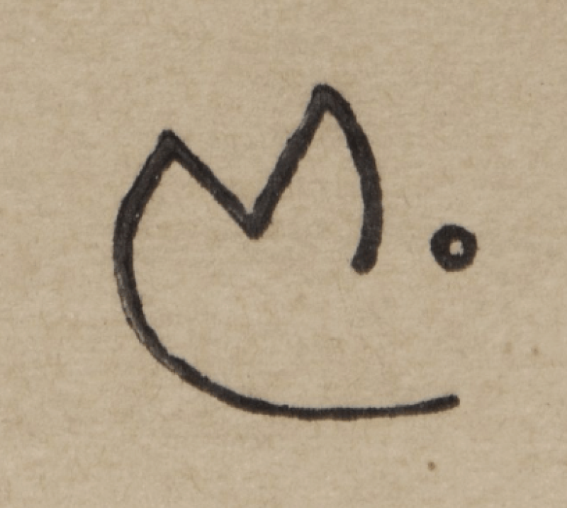
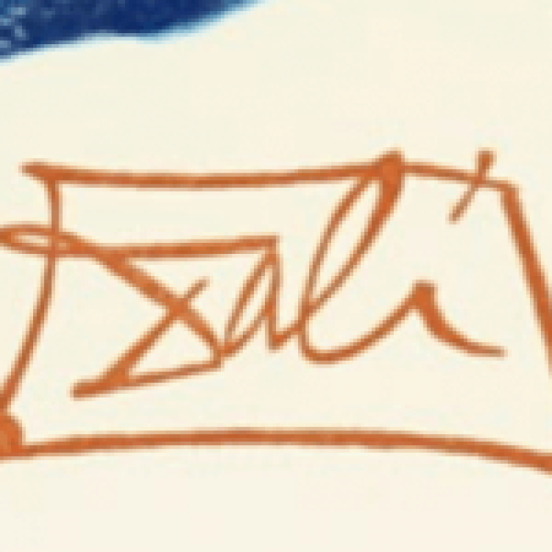
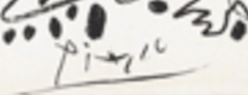
Printmaking has deep roots in Asian traditions, where it was used by Buddhist monks to reproduce texts and images through woodblock printing. The earliest known print—a woodblock impression on silk—dates from the Han dynasty and is generally placed between 206 BCE and 220 CE.
In Japan, woodblock printing arrived from China around the year 700 and was initially used to reproduce foreign texts. The technique flourished during the Edo period (1603–1868) through the aesthetic movement known as ukiyo-e—the Japanese woodblock print as it is often described in France. These prints depicted celebrated views of Japan, historical battles, and scenes of everyday life.
In Europe, the earliest prints were also woodcuts. In 15th-century Germany, woodcuts were notably used to produce playing cards.
Artists quickly embraced the medium, and printmaking flourished in the 15th century, representing a major milestone in Western visual culture by making images reproducible and widely disseminated—well before Gutenberg’s press transformed the book trade.
Metal engraving—more durable than wood and capable of much finer line—became widespread around the 1430s, again in Germany. The medium reached extraordinary heights with master engravers at the end of the 15th century, notably Albrecht Dürer. Around 1450, Johannes Gutenberg introduced movable type printing, a true revolution that enabled books to be produced on an unprecedented scale. The Gutenberg Bible is considered the first major book printed using this technique.
In the 17th century, Italian artists explored indirect intaglio methods, using acid to bite the metal plate. They refined etching, a technique already practiced by Albrecht Dürer in the 1510s. Mezzotint, which produces subtle tonal gradations and rich blacks, was invented in 1642 by a German amateur engraver. Artists such as Rembrandt exploited metal engraving to remarkable expressive ends. Over time, French printmaking entered a golden age, and prints became both fashionable and accessible. During the French Revolution, engraving also served as a powerful means of circulating ideas.
In the 18th century, Italy remained a major center of European printmaking. Artists such as Tiepolo, Canaletto, and Piranesi pushed technical and aesthetic boundaries. In Spain, the first great Spanish printmaker, Francisco de Goya, turned to etching—and later lithography—late in his life, producing a deeply personal body of work that would influence modern art, particularly Expressionism.
From the 19th century onward, the emergence of lithography gave new momentum to printmaking, a legacy that continues today. Invented by the German playwright Alois Senefelder, lithography is generally more accessible than engraving and allows for larger editions than copper plates, which can wear with repeated printing.
By the late 19th century, the era of the painter-printmaker—artists who mastered both painting and printmaking—began to redefine the medium’s possibilities. One can cite the Nabis (including Bonnard and Vuillard), the Post-Impressionist Paul Gauguin, and later the artists of the School of Paris such as Miró, Chagall, and Picasso, renowned for their work in prints. This period also marked the expansion of color, notably through the prints of the Fauves and the German Expressionists. The versatility of these artists enriched printmaking with diverse aesthetics and fully realized bodies of work.
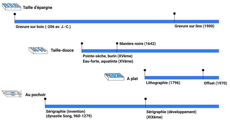
To conclude, linocut emerged around 1900, shortly after linoleum was developed as a floor covering in the late 19th century. Screen printing, however, has a much longer history: it is generally traced back to China during the Song dynasty (960–1279), when stencil-based methods using silk were employed to print early forms of paper currency. Through this long tradition, Chinese immigrants introduced the technique to the United States in the 19th century. In the 20th century, screen printing gained renewed prominence through Pop Art artists such as Andy Warhol, Robert Rauschenberg, and Roy Lichtenstein.
Here is a summary in the form of a timeline:
We have reached the end of this printmaking guide. We hope it has helped refine your understanding of the various printmaking techniques, as well as the key principles involved in collecting prints with confidence. Most of the works featured throughout this guide are available on our online gallery, and we would also be pleased to welcome you in person at our galleries in Le Marais or Saint-Germain-des-Prés.
Luc Bertrand, for Le Coin des Arts Gallery - Thaddée Poliakoff Fine Art

Secure payment
3DSecure 2.2

Free DHL Express delivery from €1,200
Carefully prepared parcel
Parcel tracking

Shipment insured
for the full value of the artwork, covering theft and damage

Fairest prices
Certificate of authenticity
Two galleries in Paris
Receive an email as soon as a new artwork is added for this artist
Your message has been sent ! We will get back to you as soon as possible.
Please fill in the form if you need further information such
Please fill in your email address, an email will be sent with a link to update your password.
You can now place orders and track your orders.
To save your wishlist, you can log in or create an account :
This is a 100% custom-made frame, carefully crafted by a professional framer. Finishes are available in light oak, white wood or black wood, with or without mat board and plexiglass. Delivery times may vary depending on the order, with an average lead time of 10 days.
This option will be offered during the cart step.